Dashboards are one of the fastest ways to turn data into decisions—if the dashboard is designed for the right decision.
A common mistake (even among experienced BI folks) is to start with charts and layout first. The better order is:
- Decide what type of dashboard you’re building (based on audience + decision + time horizon)
- Design the information architecture (KPIs, trends, diagnostics, exceptions)
- Only then pick visuals and interactions
Below are the 3 most common dashboard types used in BI, and how they typically translate into MicroStrategy dossiers/pages.
Top 3 Business Intelligence dashboard types #businessintelligence #datascience #dashboard #datavisualization #fyp bi-academy.org
1. Strategic dashboards (executive overview)
Who uses them Executives, senior management, decision makers.
Purpose Track the “health of the business” and progress against long-term goals.
What to show
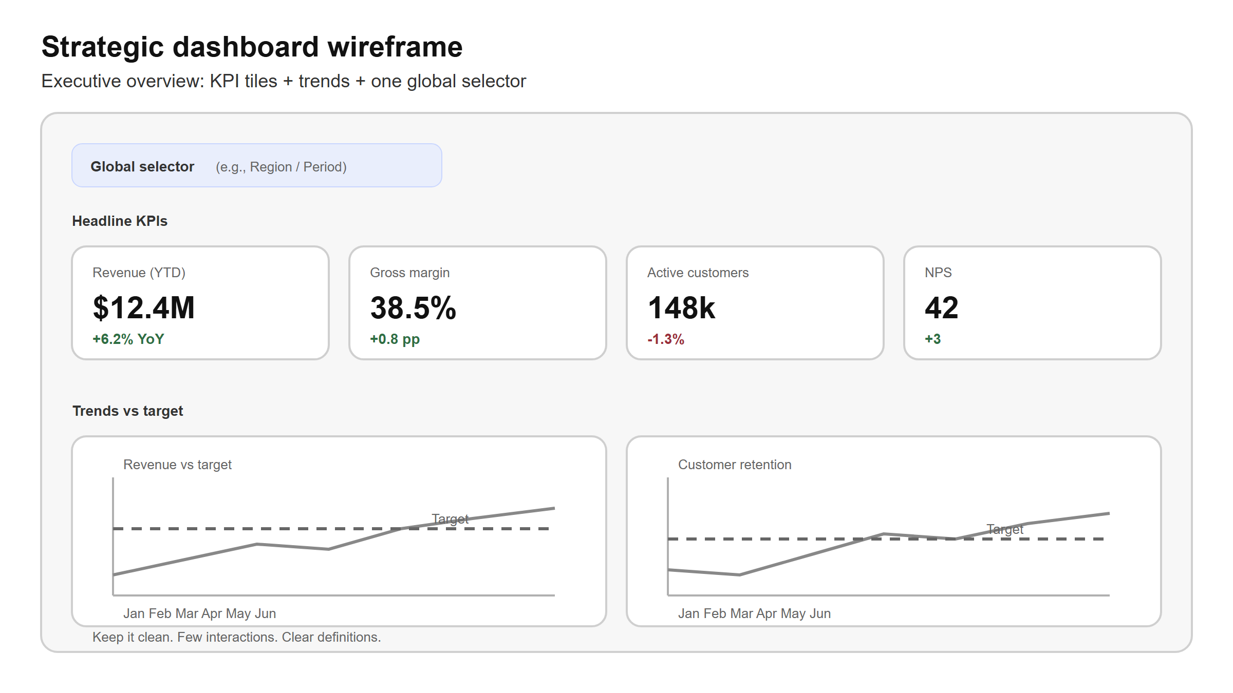
- A small set of top KPIs (usually 5–12, not 50)
- Trends vs targets (month-to-date / quarter-to-date / year-over-year)
- A few explanatory cuts (e.g., region or product line), but not deep diagnostics
MicroStrategy design guidance
- Create a dedicated Executive Overview page.
- Prefer a clean layout: headline KPIs + 2–4 trend visuals.
- Use limited interactivity: a few global filters (e.g., region), not heavy drill paths.
- Add short annotations (what does “good” mean, what changed since last month?).
Example decision “Are we on track to hit our quarterly revenue target?”

2. Tactical dashboards (management / action)
Who uses them Department managers, team leads, analysts.
Purpose Understand why performance moved and decide what to change.
What to show
- Team/department KPIs (e.g., pipeline coverage, margin, campaign ROI)
- Diagnostics: breakdowns by segment, product, channel, owner
- Comparisons: vs plan, vs prior period, vs benchmark
Design guidance
- Build a Performance & Drivers page (or multiple pages by domain: Sales, Marketing, Ops).
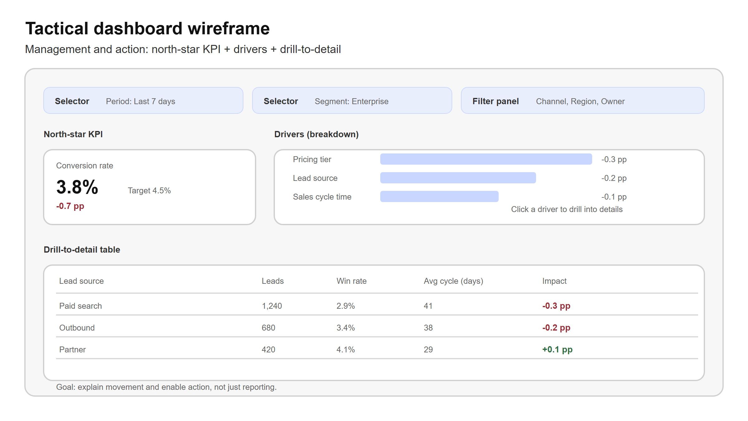
- Use interactive controls intentionally: selectors, filter panels, drill-to-detail.
- Include a “driver tree” structure:
- KPI → top 3 drivers → supporting detail table
- Keep a stable “north star” metric on screen so exploration doesn’t lose context.
Example decision “Which segment caused the drop in conversion rate, and what should we fix this week?”
3. Operational dashboards (day-to-day monitoring)
Who uses them Frontline teams, operations, support.
Purpose Monitor daily execution and react quickly to exceptions.
What to show
- Near real-time or frequent refresh indicators (depending on your data pipeline)
- Exception lists and thresholds (what needs attention now)
- Simple, repeatable views that can be checked in seconds
MicroStrategy design guidance
- Create an Operations Monitor page focused on exceptions.
- Prefer lists/tables + conditional formatting over complex visuals.
- Make “what changed?” obvious: deltas, status flags, SLA timers.
- Be honest about latency: if data refreshes hourly, design for hourly decisions.
Example decision “Which orders/tickets are at risk of breaching SLA right now?”
A simple checklist: which type do you need?
Use these three questions:
- Audience: executive / manager / frontline?
- Time horizon: quarter-month / week / today-hour?
- Decision: steer direction / change tactics / react to exceptions?
Then choose:
- Strategic → steer direction
- Tactical → change tactics
- Operational → react to exceptions
In practice, many dossiers contain multiple pages—one per dashboard type. The key is to keep each page consistent with its purpose.
Practice (10–15 minutes)
Pick one dashboard you are building.
- Write down the audience + time horizon + decision.
- Label the dashboard type.
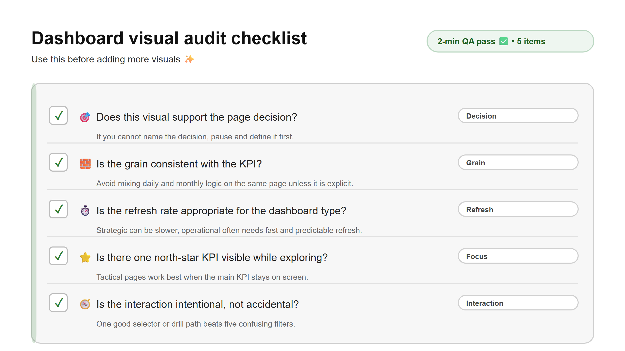
- Do a “visual audit”: for each visual, answer: “Does this help that decision?”
- Move anything that doesn’t fit into a separate tactical page (or remove it).
Expected outcome A clearer page with fewer visuals, stronger story, and better adoption.
