Having worked for more than 10 years in data & BI, I constantly see dashboards. Beautiful dashboards.
Teams spend weeks working on dashboards. Beautiful visuals. Clean layout. Every chart type you could imagine. Their stakeholder took one look and said: “This isn’t what I need.”
Sound familiar? Here’s the problem: The dashboard was never the issue. The requirements were.
The Real Problem (That Nobody Talks About)
Someone asks for a “sales dashboard” or “operational report.” You nod, open Power BI or Tableau, and start building.
Three weeks later, you present. They say:
- “Can we add X metric?”
- “This needs to update hourly, not daily”
- “My team actually needs to see it by region, not by product”
- “Oh, and can we drill down to individual transactions?”
You weren’t building the wrong dashboard. You were building a dashboard with the wrong blueprint.
According to research by Gartner, 70% of dashboard projects are rarely used after the first month. Not because of technical issues. Because they don’t answer the questions users actually have.
The solution? Stop building. Start designing. I’ll show you how!
The 9 Questions Every Dashboard Must Answer (Before You Build Anything)
Get the Framework now (free!)
Sign up to the newsletter for free and get the documents right away!
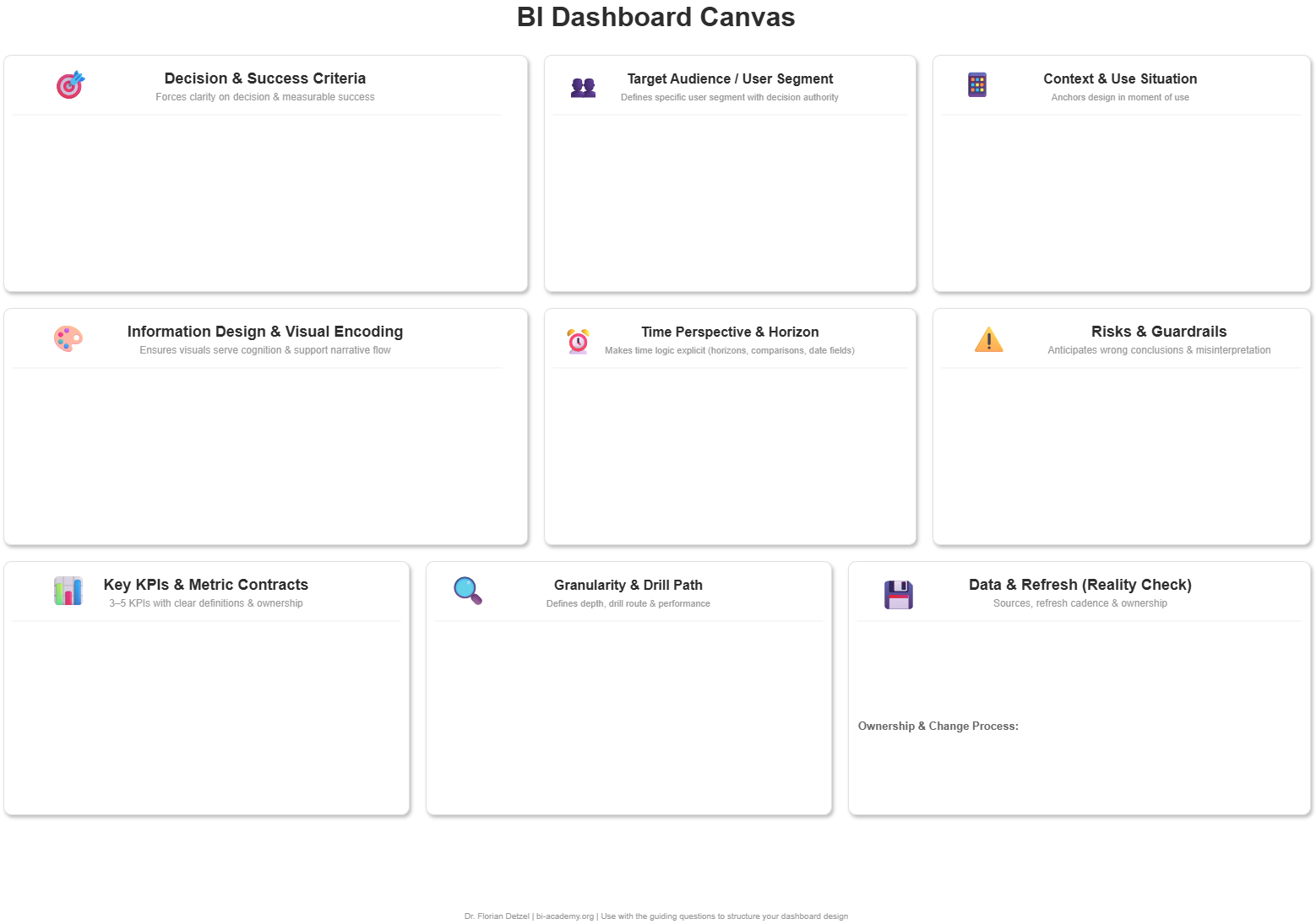
I created the BI Dashboard Canvas after watching too many talented BI professionals waste weeks on projects that were doomed from the requirements call.
It’s a simple framework: 9 fields, 9 critical questions that must be answered before you touch your BI tool.
Think of it as your dashboard blueprint. Here’s what it covers:

Strategy Layer: Who & Why
Decision & Success Criteria
What specific decision does this dashboard enable? How do we measure success?
This is the foundation. If you can’t articulate the decision, you can’t design the dashboard.
Target Audience / User Segment
Who will actually use this daily? What’s their role, skill level, and context?
A CFO needs different information than a warehouse supervisor. Design for the actual user, not the person who requested it.
Context & Use Situation
Where, when, and how will they access this? Desktop? Mobile? In meetings? On the warehouse floor?
A dashboard for boardroom presentations looks nothing like a dashboard for shift handovers.
Design Layer: What & How
Key KPIs & Metric Contracts
What metrics matter? How are they defined? What’s the calculation logic?
“Revenue” means different things to different teams. Document it now, avoid confusion later.
Time Perspective & Horizon
What time window are we analyzing? Real-time? Last 30 days? Year-over-year?
Time context changes everything about your design and data requirements.
Information Design & Visual Encoding
Which chart types tell the story? What pre-attentive attributes guide the eye?
This is where design meets cognition. The right visual makes insights instant.
Reality Layer: Can We Actually Build This?
Data & Refresh Reality Check
What data sources exist? What’s the refresh cadence? What are the known limitations?
The dream dashboard means nothing if the data doesn’t exist or refreshes weekly when you need hourly updates.
Granularity, Drill Path & Performance
What’s the starting view? How deep can users drill? Where does it stop?
Performance budgets matter. A dashboard that takes 30 seconds to load won’t get used.
Risks, Misinterpretation & Guardrails
What could users misunderstand? What context is critical? What guardrails prevent wrong conclusions?
Every metric can be misread. Your job is to make misinterpretation hard.
Why This Matters for Your Projects
Using this framework changes three things:
1. Project Speed Most students report 50% faster project delivery after using the canvas. Why? Because you’re not rebuilding after the first demo.
2. Revision Cycles Typical projects: 5-7 rounds of “can you change this?” Canvas projects: 1-2 rounds (usually minor tweaks)
3. Stakeholder Confidence When you walk into requirements meetings with these 9 questions, you immediately signal: “This person knows what they’re doing.”
Trust goes up. Scope creep goes down.
Get the Framework now (free!)
Sign up to the newsletter for free and get the documents right away!

