Data analysis plays a crucial role in understanding customer preferences and optimizing business strategies. In this blog post, we’ll walk through an analysis of a pizza sales dataset using four CSV files: orders, order_details, pizzas, and pizza_types.
The four files were uploaded to ChatGPT with one simple prompt:
give me the data model in an ER diagram and output a bar chart listing the top 5 pizza categories by number of orders for my dataset consisting of 4 CSV files
Understanding the Data Model
To begin, we explored the structure of our dataset and identified relationships between the tables. Using this information, we created an Entity-Relationship (ER) diagram, which visually represents how orders, pizza details, and pizza types are interconnected. You can view the generated ER diagram here:
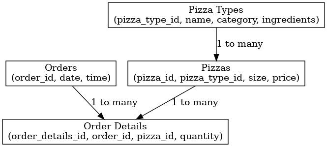
ER Diagram generated by ChatGPT
Additionally, ChatGPT provided an accurate description of each table of my dataset.
Identifying Top Pizza Categories
Once the data model was established, we analyzed pizza order trends. Specifically, we aggregated the total number of orders per pizza category and visualized the top 5 categories in a bar chart. The results provide insights into the most popular pizza types, helping businesses make informed decisions about inventory and marketing. The final chart can be viewed here:
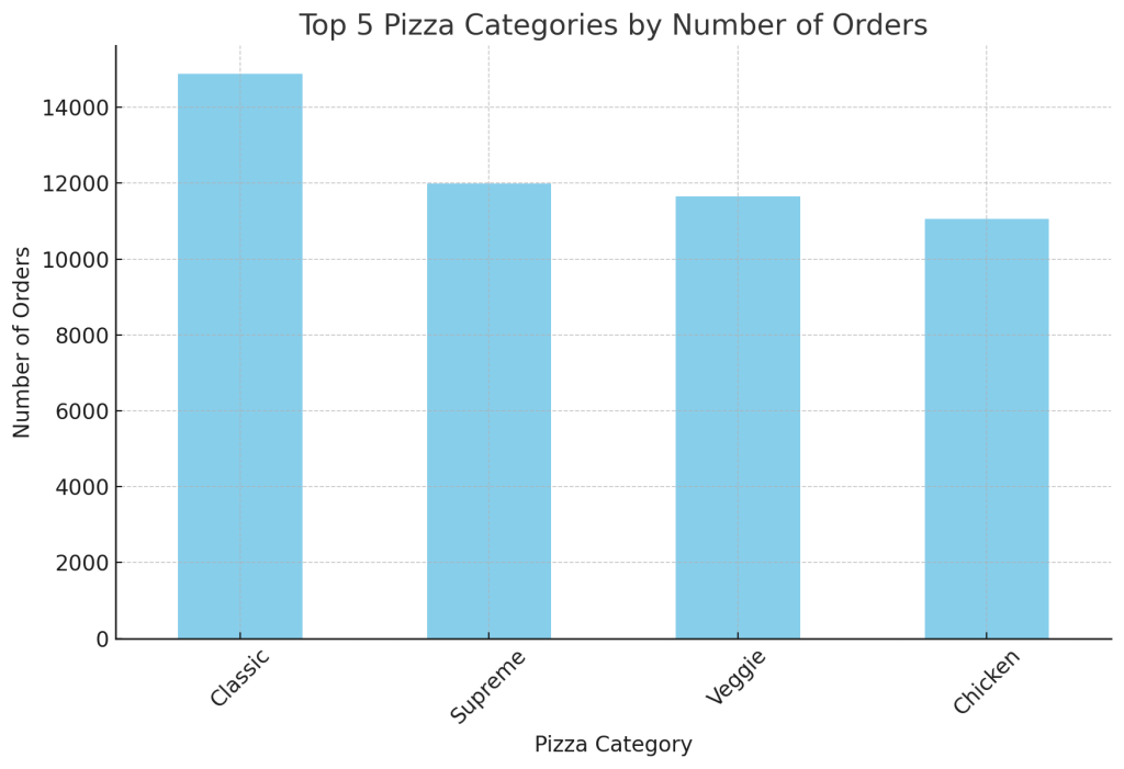
I have compared the data to my own dashboard built in MicroStrategy and the results match!
Key Takeaways
- ChatGPT can be a valuable assistant for describing and exploring an unknown data source
- ER diagrams help understand data relationships and guide efficient database design.
- Aggregating order data allows us to uncover customer preferences.
- Visualizing trends makes insights more actionable for business decisions.
This simple yet effective analysis showcases how data science can turn raw data into meaningful insights. Stay tuned for more data-driven explorations!
Follow on TikTok and subscribe to our newsletter for more!