Most dashboards fail before you ever open Power BI. Not because the visuals are wrong. Not because the data model is weak. Not because you picked the wrong chart. They fail because nobody defined the decision, the user, or the moment the dashboard is supposed to serve.
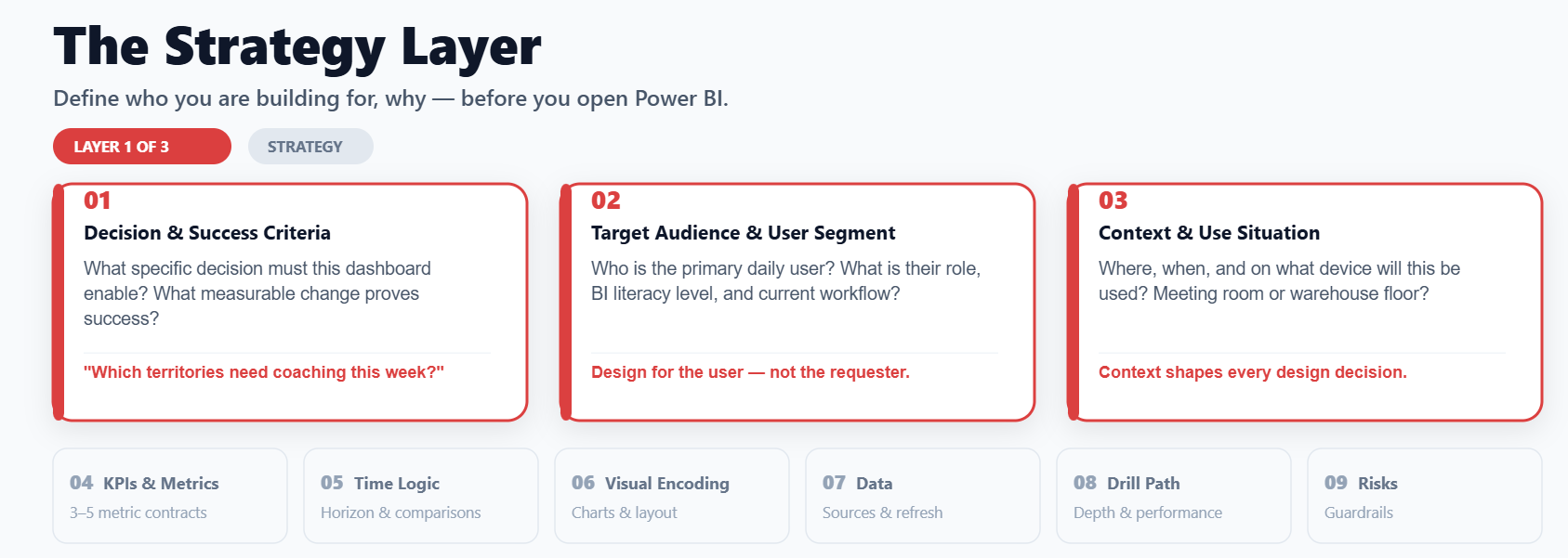
What Is the BI Dashboard Canvas Strategy Layer?
| Layer | Fields | Core Question |
|---|---|---|
| Strategy | 1,2,3 | Who are we building for, why, and when? |
| Design | 4,5,6 | What metrics, time logic, and visuals? |
| Reality | 7,8,9 | Can we actually ship this with our data? |
Field 1: Decision and Success Criteria
Field 2: Target Audience and User Segment
Design for the daily user, not the person who requested the dashboard.
Convinced? Download the Canvas by filling out the form below and signing up to our newsletter for free!
Field 3: Context and Use Situation
| Context | Interaction Recommended |
|---|---|
| Leadership Meeting | One-page summary, minimal filters, no drill-through |
| Field Operations (mobile) | KPI Cards, traffilg lights, minimal scoring |
| Analyst self-service | Full filter panel, bookmarks, drillthourh transactions |